Retell AI
Retell AI is a platform for building and managing AI voice agents that enhance contact center operations. Originally developed as a branding project during my internship, this case study was later expanded into a self-initiated product design exploration.
[Case Study]
art direction, uiux, creative prompt
motion design, brand design
01 Research
What I found
Method
Problem
Retrospective audit — looking at the product with fresh eyes and asking what a B2B buyer actually needs to see.
Reviewed similar AI and SaaS product websites.
Evaluated Retell AI’s current website experience and usability.
Analyzed content hierarchy, navigation, readability, and feature clarity.
Reviewed interaction speed, information density, and CTA placement.
Unclear Content Hierarchy
The website introduces conversion actions before clearly explaining the product, making the user journey feel fragmented.
Heavy Website Performance
High visual and interaction load impacts responsiveness and slows navigation.
Weak Readability
Typography sizing and spacing reduce scanability across sections.
Unclear Messaging
The tagline and introductory copy rely heavily on technical language, making the product difficult to understand quickly.
Fragmented Feature Presentation
Product features are distributed across too many sections, making the platform feel overly complex.
Inconsistent Information Architecture
Section naming and feature categorization lack clarity and consistency.
06
Critical usability and hierarchy issues identified
3+
Redundant CTAs and overlapping feature groups removed
02
Core navigation and storytelling flows restructured
02 User Flow
Flow Comparison
Rationale
Mapping how a B2B buyer moves through the site — and where the old version lost them.

A B2B buyer landing on an unfamiliar product needs orientation before action. The old flow asked for commitment too early.
New flow: establish what the product is → show it in motion → then invite them to try it. Each step reduces friction for the next.
03 Stress Test
Comparison
Changes
Four key changes to improve storytelling order and make the experience easier to understand.
New Site

Old Site

1. Navigation & Layout
Simplified the navigation structure to create a cleaner browsing experience.
-
Moved Pricing and Contact Sales under Product
-
Removed repetitive CTAs:
-
Try for Free
-
Try Our Live Demo
-
Contact Sales
-
-
Reduced unnecessary secondary text to improve visual clarity
2. Copy Refinement
Simplified messaging to make the product easier to understand at first glance.
-
Rewrote the tagline with clearer language
-
Reduced technical jargon and improved readability
3. Storytelling & User Flow
Reorganized the experience to introduce the product before asking users to take action.
-
Introduced the product with a demo video earlier in the experience
-
Delayed demo conversion prompts until after product understanding
4. Information Architecture
Consolidated related content into clearer sections to reduce cognitive overload.
-
Combined information into structured groups
-
Improved content hierarchy
04 Mockup
Changes
*To accurately represent the product experience, the demo footage featured in the “AI Phone Agent Platform,” “Consistent High-Quality AI Calls,” and “Reliable Telephony for Better Call Results” sections was screen-recorded from the company’s official website. Credit for the original motion content belongs to the company.

1. Ungrouped Information
Reorganized product features to improve navigation and discoverability.
Stress Test features a single grouped experience, however,
following the three-click usability principle, features were restructured into simplified language to help users quickly understand key capabilities.
2. Simplified Messaging
Refined the copy system with clearer, less technical language.
3. Brand Expression
Introduced additional branding elements to create a more cohesive visual identity.
4. Refined Color System
Adjusted the color palette to improve visual consistency, hierarchy, and overall cohesion across the experience.
5. Subtle Interaction
Added lightweight motion and interactive elements to create a more responsive and engaging browsing experience.
Revised flow and copy into screen layouts — balancing clarity with the product's visual identity.


05 Branding
Assets developed during the internship — motion and visual identity work carried into the redesigned site.
Font & Color
Font Family:
the font balances clarity, scalability, and a contemporary tech aesthetic.
Color Choices:
builds on Retell’s established color palette to preserve brand identity.
UI elements
Inter Semibold
headings & emphasis.
Inter Medium
body text
Inter Regular


Logo Animation
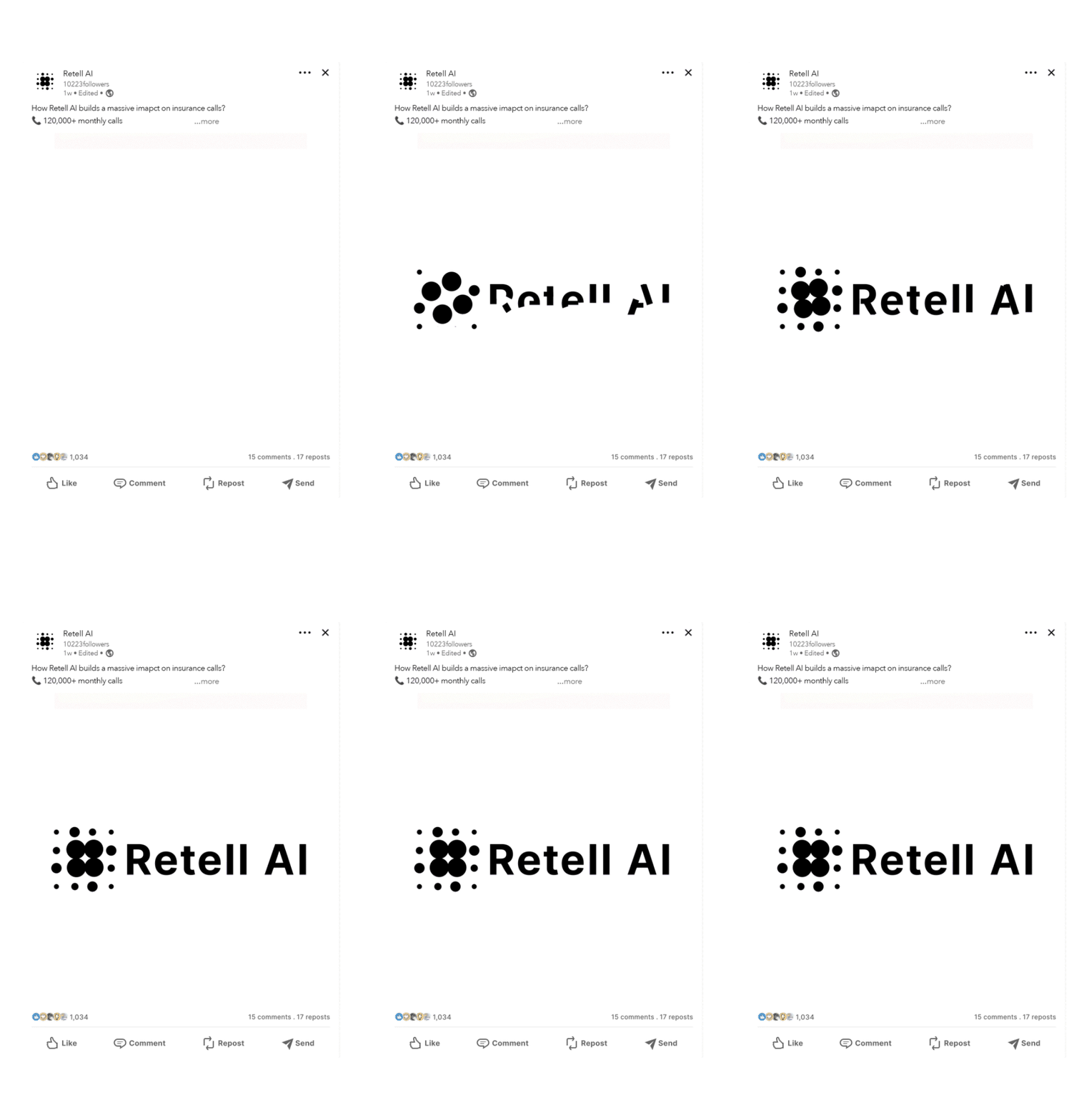
Logo Animation Storyboard

Article Thumbnails Mockups


06 Outcome
What Changed
Thesis
Story
Reordered to earn interest before asking for commitment
Copy
Plain language replaces product jargon throughout
Clarity
Demo video answers "what is this?" before the CTA
A B2B product site that builds trust before asking for action — and a case study that shows end-to-end design thinking.
Every decision in this project comes from one key insight: the original site expected viewers to already care.
The redesign focuses on building that interest first through a clearer story flow, simple copy, helpful images, and a product video that makes trying the product feel easier and less risky.
The result is a site that respects a B2B buyer’s time and helps guide them to take the next step.