is a multidisciplinary designer based in nyc, working across product, motion, brand design & AI experiences.
Retell AI
Retell AI is a platform for building and managing AI voice agents that enhance contact center operations. *Originally developed as a branding project during my internship, this case study was later expanded into a self-initiated product design exploration.
[Case Study]
art direction, uiux, creative prompt
motion design, brand design
01 Research
What I found
Method
Problem
Retrospective audit — looking at the product with fresh eyes and asking what a B2B buyer actually needs to see.
Reviewed similar AI and SaaS product websites.
Evaluated Retell AI’s current website experience and usability.
Analyzed content hierarchy, navigation, readability, and feature clarity.
Reviewed interaction speed, information density, and CTA placement.
Core Problem: Unclear Product Story & Messaging
Product Value Is Not Introduced Early Enough
Users struggle to understand what the product is, who it serves, and why it matters before being asked to explore it.
Information Is Difficult to Connect
Users cannot easily understand how different features connect across the platform.
Key Information Is Hard to Scan
Unclear hierarchy, readability issues, and visual distractions.
06
Critical usability and hierarchy issues identified
3+
Redundant CTAs and overlapping feature groups removed
02
Core navigation and storytelling flows restructured
02 User Flow
Flow Comparison
Rationale
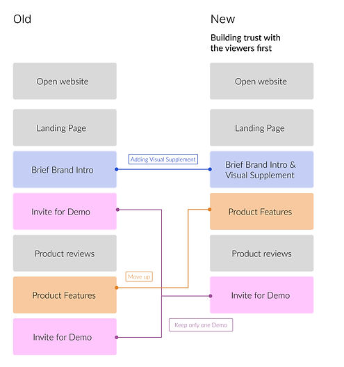
Mapping how a B2B buyer moves through the site — and where the old version lost them.
Users need to understand what a product is and why it matters before deciding to try it.
New flow: establish what the product is → show it in motion →
invite them to try it. Each step reduces friction for the next.
03 Stress Test
Comparison
Changes
Four key changes to improve storytelling order and make the experience easier to understand.
New Site

Old Site

1. Navigation & Layout
Users can now find what they need easily because the navigation is simpler and less cluttered. Pricing and sales options are grouped logically, and repeated prompts to take action have been removed to reduce distraction.
2. Copy Refinement
Users can understand the product faster because the messaging is clearer and easier to read at first glance.
3. Storytelling & User Flow
Users are introduced to the product before being asked to take action, helping them understand its value first.
4. Information Architecture
Users can process information easily; the structure has been simplified to reduce cognitive overload and make the page easier to follow.
04 Mockup
Changes
*To accurately represent the product experience, the demo footage featured in the “AI Phone Agent Platform,” “Consistent High-Quality AI Calls,” and “Reliable Telephony for Better Call Results” sections was screen-recorded from the company’s official website. Credit for the original motion content belongs to the company.

1. Product Structure
Users can find and understand product features easily because related information is grouped and simplified.
2. Simpler Messaging
Users can understand the product faster because the language has been simplified and made less technical.
3. Brand Experience
Users experience a more unified and recognizable product because visual elements are aligned across the interface.
4. Visual Hierarchy
Users can scan and understand information more easily because color is used more consistently to guide attention.
5. Responsive Interaction
Users get clearer feedback while browsing because subtle motion helps the interface feel more alive and responsive.
Revised flow and copy into screen layouts — balancing clarity with the product's visual identity.


05 Branding
Assets developed during the internship — motion and visual identity work carried into the redesigned site.
Font & Color
Font Family:
the font balances clarity, scalability, and a contemporary tech aesthetic.
Color Choices:
builds on Retell’s established color palette to preserve brand identity.
UI elements
Inter Semibold
headings & emphasis.
Inter Medium
body text
Inter Regular


Logo Animation
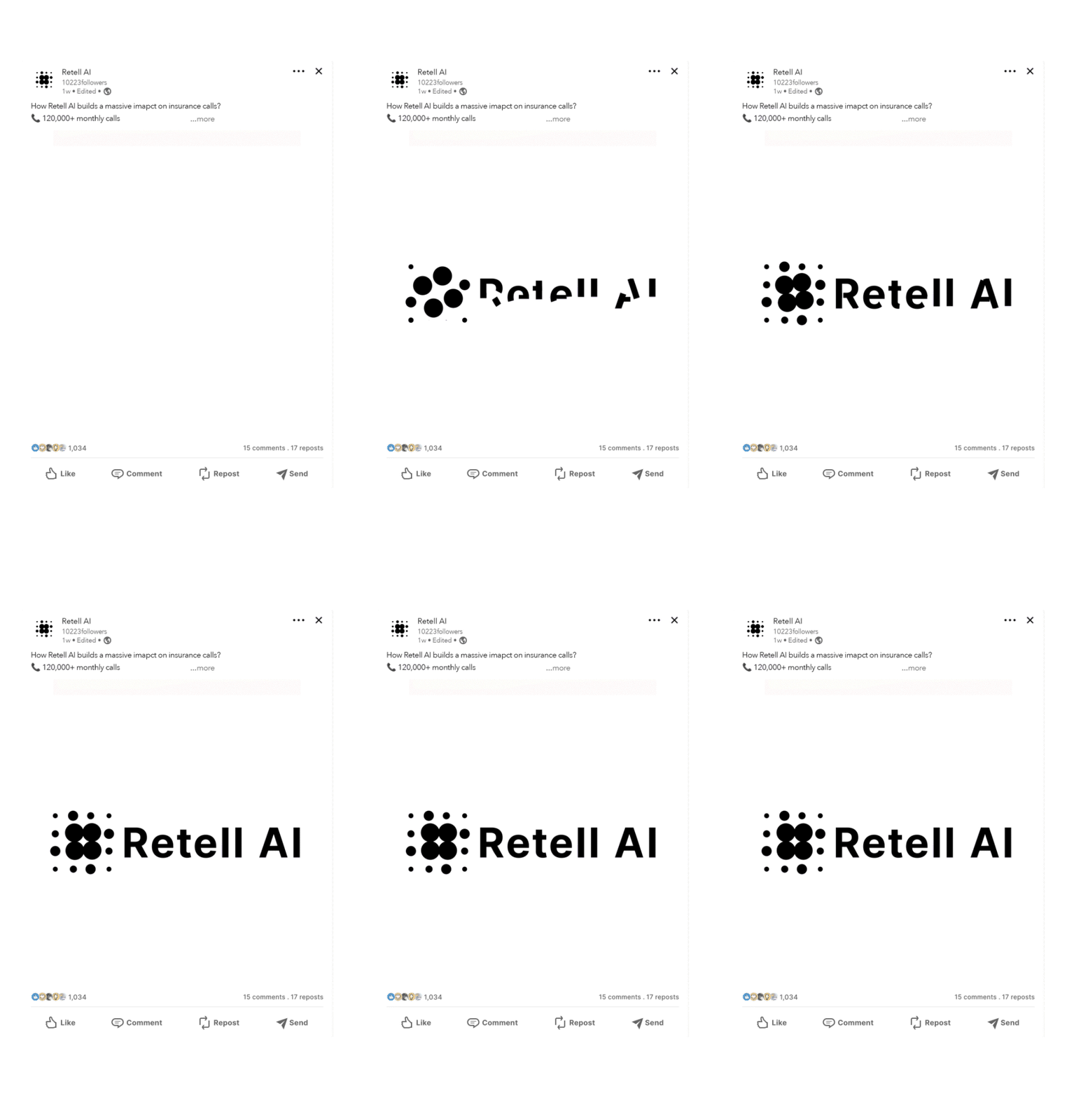
Logo Animation Storyboard

Article Thumbnails Mockups


06 Outcome
What Changed
Thesis
Story
Reordered to earn interest before asking for commitment
Copy
Plain language replaces product jargon throughout
Clarity
Demo video answers "what is this?" before the CTA
A B2B product site that builds trust before asking for action — and a case study that shows end-to-end design thinking.
Every decision in this project comes from one key insight: the original site expected viewers to already care.
The redesign focuses on building that interest first through a clearer story flow, simple copy, helpful images, and a product video that makes trying the product feel easier and less risky.
The result is a site that respects a B2B buyer’s time and helps guide them to take the next step.